
7 QuickBooks dashboard examples (with real screenshots)
Most QuickBooks dashboard round-ups show you a chart and move on. That is not enough to know if a dashboard is any good. Every example below pairs the screenshot with the metrics on it and the actual decision it exists to drive — because a chart nobody acts on is not a dashboard, it is decoration.
9 min read
These seven views come from DashEase, Orivian’s QuickBooks reporting product, built with realistic demo data — never a real client’s books. If you would rather have Orivian build this around your specific reporting questions, QuickBooks dashboards is the consulting path for that. Either way, the point of this list is the same: a dashboard earns its spot on your screen by changing what you do next, not by looking impressive.
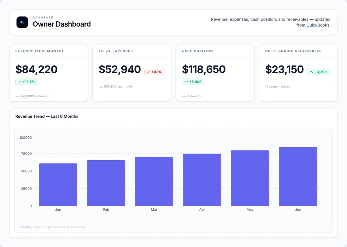
1. Owner overview
Metrics on this dashboard
- Revenue this month
- Total expenses
- Cash position
- Outstanding receivables
- Revenue trend, last 6 months
The decision it drives
Whether this month's numbers support hiring, a new purchase, or holding steady — the single question most owners open QuickBooks to answer, and the one it answers worst without a dashboard.
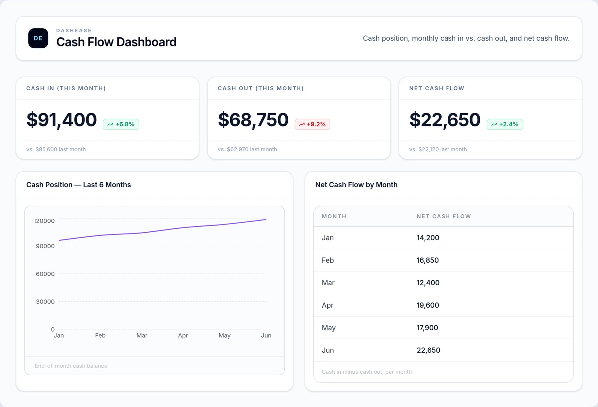
2. Cash flow
Metrics on this dashboard
- Cash in this month
- Cash out this month
- Net cash flow
- Cash position trend, last 6 months
- Net cash flow by month
The decision it drives
Whether cash coming in will cover payroll and vendor bills over the next few weeks — flagged before the gap shows up as a low bank balance, not after.
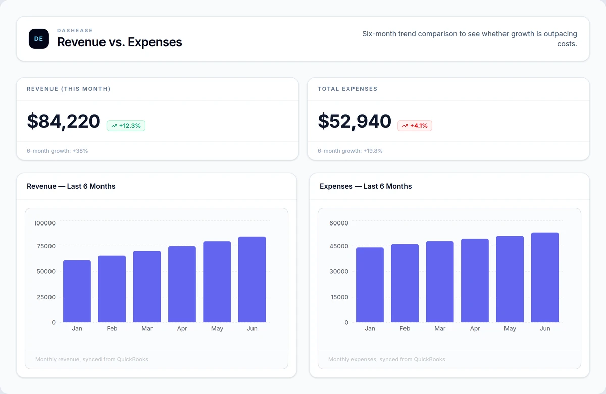
3. Revenue trends
Metrics on this dashboard
- Revenue this month
- Six-month revenue growth
- Total expenses
- Six-month expense growth
- Revenue and expenses, side by side
The decision it drives
Whether revenue growth is outpacing rising costs or getting quietly eaten by them — the comparison a single P&L report forces you to calculate by hand.
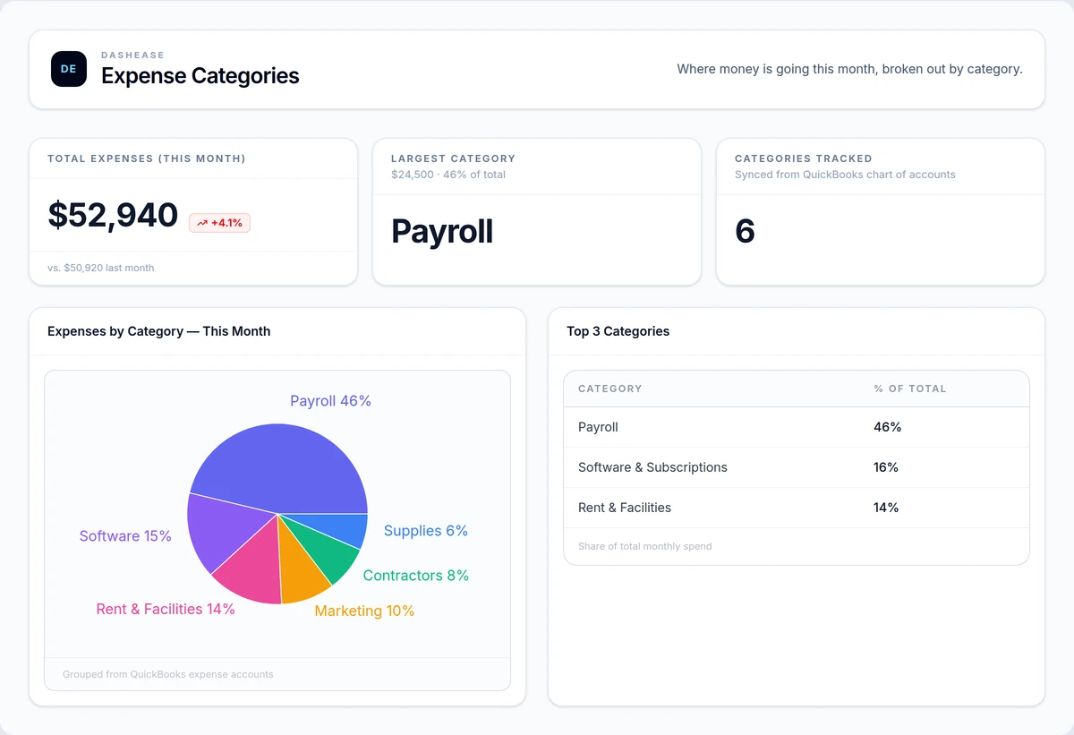
4. Expense categories
Metrics on this dashboard
- Total expenses this month
- Largest expense category
- Categories tracked
- Top 3 categories by share of spend
The decision it drives
Which expense category to cut first when margins tighten — obvious once spend is grouped by category, buried when it's one total on a P&L.
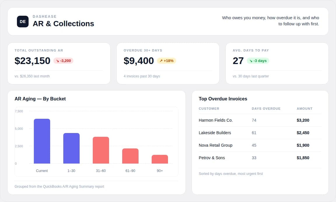
5. AR / collections
Metrics on this dashboard
- Total outstanding AR
- Overdue 30+ days
- Average days to pay
- AR aging by bucket
- Top overdue invoices
The decision it drives
Who to call this week to protect cash before an unpaid invoice becomes a collections problem — ranked by how overdue it is, not buried in an aging report nobody opens.
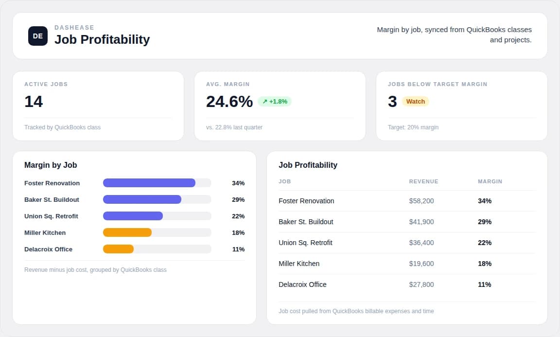
6. Job / project profitability
Metrics on this dashboard
- Active jobs
- Average margin
- Jobs below target margin
- Margin by job
- Revenue by job
The decision it drives
Which jobs to bid like the last one, and which to stop taking on — visible once margin is broken out by job instead of blended into one company-wide number.
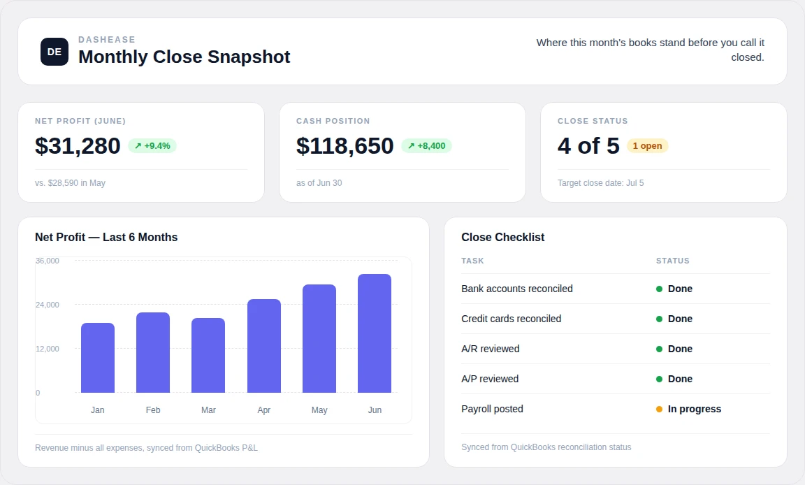
7. Monthly close snapshot
Metrics on this dashboard
- Net profit this month
- Cash position
- Close checklist status
- Net profit trend, last 6 months
The decision it drives
Whether the books are actually ready to close and act on — reconciliation status and the trend line in one place, instead of a checklist in someone's head.
What separates a real dashboard from a report with a chart on it
Notice what the seven examples above have in common: none of them are a single number sitting alone. Every metric is either compared to a prior period, broken into a trend, or ranked against the others in its category. That is what turns a static figure into something you can act on without doing mental math first.
The second pattern is restraint. Each dashboard shows four to five metrics, not fifteen. A dashboard that mirrors every report QuickBooks can generate is not more useful than the reports themselves — it just moves the same overwhelm into a nicer layout. Pick the metrics that would actually change what you do this week, and leave the rest in QuickBooks where an accountant can pull them when needed.
If you want to build views like these from your own QuickBooks data, start with the same question each example above answers: what decision is this dashboard supposed to drive? Everything else — which metrics, which chart type, how often it refreshes — follows from that answer.
See these dashboards on your own QuickBooks data.
DashEase connects to QuickBooks and builds the views above — revenue, cash flow, expenses, AR, job profitability, and close status — updated automatically. Free to start.